Color Palette
Color is a core element of the Sam M. Walton College of Business visual identity. The colors in this guide are the approved color palette of the University of Arkansas and must be used consistently across all Walton College communications. Adhering to these standards strengthens brand recognition, ensures visual consistency, supports accessibility and reinforces a unified, professional identity for both the Walton College and the University of Arkansas. For complete requirements and usage standards for both print and web, refer to the University of Arkansas color guidelines here.
Primary Colors
Razorback Red and Apple Blossom (white) are the primary colors of the University of Arkansas and form the foundation of the Walton College color palette. For print materials, primary colors should account for approximately 70% of the overall design. In digital applications, white should serve as the dominant color, making up roughly 50% to 60% of the layout, with Razorback Red used intentionally and limited to about 25% of the design.
Razorback Red
Pantone: 201 C
CMYK: 24 | 100 | 78 | 17
RGB: 161 | 0 | 47
HEX: #9D2235
Apple Blossom
CMYK: 0 | 0 | 0 | 0
RGB: 255 | 255 | 255
HEX: #FFFFFF
Secondary & Accent Colors
Secondary Colors:
Secondary colors are used to support and complement the primary color palette,
allowing Razorback Red and white to remain the most prominent visual elements. In
print materials, secondary colors should account for approximately 20% of the overall
design.
Cardinal Red
CMYK: 0 | 100 | 90 | 5
Black
CMYK: 0 | 0 | 0 | 100
Silver Leaf
CMYK: 21 | 13 | 8 | 0
Accent Colors:
Accent colors may be used sparingly to add visual interest or emphasis, but
they should never exceed 10% of a layout to ensure the overall design remains cohesive
and on brand.
Spring Water
CMYK: 80 | 27 | 21 | 3
Pine
CMYK: 80 | 55 | 90 | 3
Golden Oak
CMYK: 0 | 17 | 83 | 14
Hickory
CMYK: 37 | 49 | 72 | 14
Spoofer's Stone
CMYK: 71 | 53 | 55 | 53
Secondary Colors:
Secondary colors are used to support and complement the primary color palette,
allowing White and Razorback Red to remain the most prominent visual elements. In
digital designs, secondary colors should account for approximately 15% of the overall
design
Quartz
RGB: 242 | 242 | 242
HEX: #F2F2F4
Silver Leaf
RGB: 199 | 200 | 201
HEX: #C7C8C9
Spoofer's Stone
RGB: 70 | 70 | 72
HEX: #464648
Accent Colors:
Accent colors may be used sparingly to add visual interest or emphasis, but
they should never exceed 10% of a layout to ensure the overall design remains cohesive
and on brand.
Buckskin
RGB: 221 | 186 | 150
HEX: #DDBA96
Hickory
RGB: 149 | 117 | 82
HEX: #957552
Bauxite
RGB: 73 | 45 | 20
HEX: #492D14
Clear Sky
RGB: 157 | 201 | 213
HEX: #9DC9D5
Spring Water
RGB: 62 | 148 | 170
HEX: #3E94AA
Storm Cloud
RGB: 15 | 56 | 66
HEX: #0F3842
Color Ratios
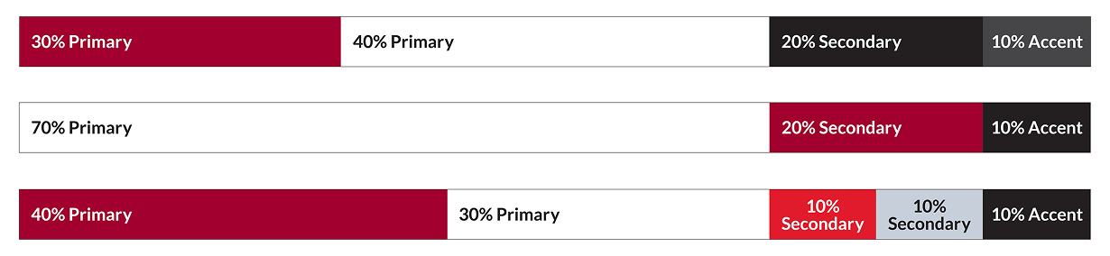
Ratios:
To keep Walton College communications visually consistent and recognizable,
print designs should rely primarily on the approved University of Arkansas color palette.
Aim for at least 70% primary colors, or at least 90% when combining primary and secondary
colors. This allows for flexibility in design while ensuring our primary colors remain
the most visible and impactful. Accent colors can be used to add interest or highlight
key things, but they should make up no more than 10% of a design. Following these
ratios helps maintain a strong visual connection to the University of Arkansas and
ensures Walton College materials feel cohesive, professional and clearly part of our
brand.
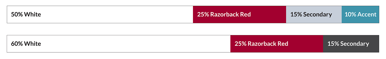
Ratios:
In digital designs, white should serve as the main color, making up about
50% to 60% of the layout, with Razorback Red used intentionally and limited to about
25% of the design. Following these ratios helps maintain a strong visual connection
to the University of Arkansas and ensures Walton College materials feel cohesive,
professional and clearly part of our brand.