Photo & Video
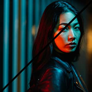
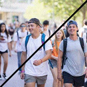
Photography and video are essential to how the Sam M. Walton College of Business is represented. This section outlines standards and best practices for using imagery and video effectively, including guidance on photo selection, what to avoid, video text overlays and proper logo placement. All visuals used across Walton College communications should be high quality, engaging and reflective of the college’s commitment to excellence, with an emphasis on authentic moments, people and connection.
- Images should not feel overly processed, staged, or use ready-made filters.
- Photos of buildings should include as much of the building as possible through three point perspective.
- You should avoid using stock photos. Stock photos should only be used as a last resort.
- The subject of any photo should be in focus, and be the focal point of the image.
- The atmosphere in an image should always appear open, friendly and inviting.
- Images should be colorful and diverse unless otherwise stated within the campaign.
When choosing photos to use on social media posts, videos, or other promotional content, be sure to consider the following:
- That the students look happy
- The students are dressed appropriately
Editing the photo is just as important as the subject matter. Keep the editing to a minimum so that photos look as natural as possible.
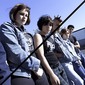
It is equally important to avoid showing the wrong type of imagery in promotional content. The following are things to avoid when taking or choosing photos:
- Students looking stressed
- Over-saturated editing/lighting
- Difficult to recognize Razorback logos
- Images that are too grainy/blurry
- Unrecognizable architecture
- Students who look unfriendly


Lower third graphics should be slightly animated, but not distracting. Myriad Pro or Lato are the typefaces used for lower third graphics.


The logo should always be used with legibility in mind, pay special attention to contrast between the logo and the background, higher contrast is necessary to preserve legibility and accessibility.
Left Example is Correct: Clear and easy to spot at the bottom of the image.
Right Example is Incorrect: Clear and easy to spot at the bottom of the image.
If you require photography or videography services, fill out a request form here.